If you are new to Flowx, you may feel overwhelmed when you see the main screen for the first time. Don't worry, this is common and normal. This is due to unfamiliarity rather than complexity.
Flowx is simple once you understand it.
There are two sections to the main screen:
- the graphs and gauges at the top
- and the map at the bottom
The top graphs and gauges look busy so let's leave them for later and start with the map. Besides, the map is the most fun.
The Weather Map
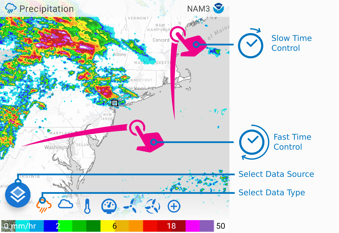
Here are the main controls of the weather map which can be mastered in 3 steps:
Step 1. Time Control
- Horizontal swipe for fast time change.
- Vertical swipe for slow time change.
Tip
Tap on the clock icon to snap to the current time.
Step 2. Selecting Data
You can change the data shown on the map by selecting the weather icons at the bottom of the map.
Try a few, for example: precipitation on top of total cloud, or wind streamlines on top of temperature to see how the wind draws warm or cold air into a region.
Step 3. Selecting Sources
Now you can change between data sources (weather simulations) via big button at the bottom-left of the map. This allows you to get an idea of the variation and commonalities between different predictions.
For example, if you turn on precipitation, you may see some sources predicting the precipitation to arrive earlier than others, or some sources might predict the precipitation to dissipate.
Bonus Step: You can pinch-to-zoom to zoom in/out of the map.
Graphs and Gauges
Graphs
The graphs may look busy, but they have been designed over many years to be easy to read at a glance. After a little while you'll get used to the colors and in a glance you'll automatically think:
- "there's a bit of rain, but then it briefly clears up"
- "looks like it gets cold tomorrow - better take a cardi "
- "it gets warm and sunnish on Sunday"
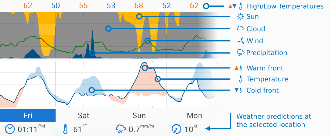
Gauges
While the graphs allow you to get a quick idea of the weather at a glance, the gauges give you more detail. You can swipe on the map to the time of interest and get the predicted values for that time.
Bonus: Compare Mode
If you double-click on the graph, you can compare predictions across multiple data sources. This is powerful tool for deciding how likely a weather event is to happen. For example, if all data sources predict it will be rainy and cold tomorrow, then it's likely to happen.